Previous Post

Visual Storytelling: Presentation Mistakes for Effective Presentations
In the world of presentations, a compelling story isn’t just told—it’s shown. Visual storytelling transforms ordinary slides into engaging narratives, captivating your audience while conveying your message effectively. However, even the most beautifully designed presentations can falter due to common presentation mistakes. This guide will explore how to avoid these pitfalls and deliver effective presentations with impeccable presentation layouts and design consistency. And with AI-powered tools like hicreo.com, creating professional, polished presentations has never been easier.
Next Post

Business Presentations: Best Pitch Deck with Pitch Deck Generator
Creating impactful business presentations is a vital skill for professionals across industries. Whether you are pitching a groundbreaking idea, presenting financial updates, or showcasing a project proposal, the quality of your presentation can determine its success. The days of manually designing slides and struggling with layout are over. With advanced tools like pitch deck generators and AI presentation software, you can streamline the process and focus on delivering a compelling message.
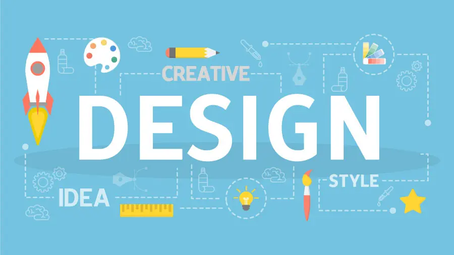
Design Principles for Presentation Design: Top Presentation Tips

Latest Blogs
Student Engagement: Master Effective Presentation Skills Today
Audience Engagement with Effective Storytelling in Presentations
Top 20 Classroom Presentation Ideas for Students to Shine
Presentation Ideas for Students: Fun and Engaging Topics to Impress Your Class
Presentation Ideas for Students Featuring Interactive and Fun Activities
Topics
Creating a compelling presentation involves more than just arranging words and images on slides. The foundation of great presentation design lies in understanding and applying design principles effectively. Whether you're preparing for a corporate pitch, an academic presentation, or a creative showcase, following the right presentation tips can make your slides visually impactful and memorable.
In this blog, we’ll cover essential design principles like visual hierarchy, white space, and practical strategies to elevate your presentation design. Stick around until the end for a special mention of how hicreo.com, an AI-powered presentation maker, can streamline this process.
1. Start with a Strong Visual Hierarchy
Visual hierarchy is the arrangement of design elements to guide the viewer’s eye to the most important information first. In presentation design, this principle ensures that your audience focuses on key messages without getting overwhelmed.
Tips for Visual Hierarchy in Presentation Design:
- Use contrasting font sizes: Headlines should be larger than subheadings, and subheadings should be larger than body text.
- Leverage colors wisely: Bold or bright colors can draw attention to critical points, while muted tones support secondary information.
- Prioritize alignment: Elements should be aligned consistently to create a structured and professional appearance.
2. Embrace White Space
Many presenters fear leaving space empty, but white space (or negative space) is a powerful tool in design. It enhances readability, prevents clutter, and creates a polished look.
Why White Space Matters:
- Improves focus: Clear, uncluttered slides make it easier for your audience to focus on the key message.
- Adds elegance: Slides with intentional white space look professional and aesthetically pleasing.
- Supports readability: Text surrounded by ample white space is easier to read and process.
How to Use White Space Effectively:
- Avoid overloading slides with text or images. Use one key idea per slide.
- Space out elements like bullet points and charts for better visual clarity.
- Let your margins breathe—don't cram content into every corner of the slide.
3. Choose Fonts Strategically
Typography plays a crucial role in presentation design. The right fonts can enhance your message, while poor font choices can distract or confuse your audience.
Font Tips for Presentations:
- Stick to a maximum of two font families to maintain consistency.
- Use sans-serif fonts like Arial or Roboto for better readability on screens.
- Ensure text contrast: Light text on dark backgrounds or vice versa is ideal.
- Keep font sizes legible: Headlines should be 36-44 pt, body text 18-24 pt.
4. Incorporate High-Quality Visuals
Visuals, such as images, charts, and icons, can communicate ideas more effectively than text alone. They break monotony, engage your audience, and clarify complex concepts.
Presentation Tips for Visuals:
- Use high-resolution images to avoid pixelation.
- Keep charts simple and limit data points to avoid overwhelming your audience.
- Incorporate icons to represent concepts concisely and visually.
- Ensure visuals are relevant and aligned with your message.
5. Master Color Psychology
Colors evoke emotions and set the tone for your presentation. Leveraging color psychology can help you communicate more effectively.
Color Tips for Presentation Design:
- Warm colors (red, orange, yellow) can evoke energy and urgency.
- Cool colors (blue, green) convey calmness and professionalism.
- Limit your color palette to 2-3 main colors to avoid a chaotic look.
- Use contrast to make text stand out, especially against backgrounds.
6. Structure Your Slides for Storytelling
A good presentation tells a story. Structuring your slides to follow a narrative arc keeps your audience engaged and ensures your message is memorable.
Storytelling Framework for Presentations:
- Introduction: State the problem or opportunity.
- Body: Present data, solutions, or arguments.
- Conclusion: Deliver the takeaway message or call to action.
7. Keep It Simple and Concise
The golden rule of presentation design is simplicity. Slides cluttered with too much information can confuse your audience and dilute your message.
How to Simplify Slides:
- Limit text to key points (5-7 words per line, 3-5 bullet points per slide).
- Use visuals to explain complex ideas instead of lengthy paragraphs.
- Focus on one idea per slide for clarity.
8. Pay Attention to Alignment and Grids
Proper alignment gives your slides a professional and clean appearance. Using grids ensures consistency in the placement of elements across all slides.
Tips for Effective Alignment:
- Align text, images, and shapes to a grid or guideline for uniformity.
- Use tools like smart guides in presentation software to snap elements into place.
- Avoid placing elements haphazardly; misaligned content distracts from your message.
9. Add Animation and Transitions Thoughtfully
Animations and transitions can add dynamism to your presentation, but overusing them can distract or annoy your audience.
Best Practices for Animations:
- Use subtle transitions (like fade or slide) for a polished look.
- Highlight elements (e.g., bullet points) with animations only when necessary.
- Avoid flashy effects like "bounce" or "spiral," which can appear unprofessional.
10. Test Your Presentation Before the Big Day
Even the best-designed presentation can falter without thorough testing. Before presenting, ensure your slides are visually appealing and functional.
Checklist for Presentation Testing:
- Review for typos, grammatical errors, and inconsistencies.
- Test animations, transitions, and embedded media to ensure smooth playback.
- Check the visual impact on different screen sizes and projectors.
How hicreo.com Can Simplify Your Presentation Design
Designing a presentation that adheres to these principles might seem daunting, but that's where hicreo.com comes in. As an AI-powered presentation maker, hicreo.com takes the guesswork out of creating stunning slides. It automates design processes like layout optimization, font selection, and color matching, allowing you to focus on your content.
With hicreo.com, you can:
With hicreo.com, you can:
- Generate professional-quality slides in minutes.
- Access a library of templates designed with key design principles in mind.
- Customize slides effortlessly while maintaining a polished look.
Relevant Post:
The Science of Stunning Slides: How to Create Visually Appealing Presentations
Visual Storytelling 101: How to Create Engaging Presentation Narratives
From Boring to Brilliant: How to Transform Your Presentation Design
Elevate Your Professional Brand: The Importance of Polished Presentations
PowerPoint Presentation Templates: Boost Your Productivity with hicreo.com